There are many threats to a successful software development project. While prototyping seems on the surface to be a 100% wholesome and good thing, it does need to be used wisely and be properly qualified, or it can become one of those threats. Like other aspects of project development, prototyping needs to be done well and with purpose.
This article refers a lot to prototypes. In our model we differentiate very specifically between mockups and prototypes. We will often sketch up a screen on a whiteboard or in a tool like Balsamiq. These are useful for getting buyin for a layout or a specific concept. This is a step or many in the development of the prototype. These sketches become archived in the project history within design docs and JIRA issues.
We view the prototype as a specific deliverable. It is where the vision for a project comes together. Where we communicate the following things to our clients.
We understand your problem
We know how to solve your problem
We are really good at this
Imagine your team using this tool
On the surface this may seem at odds with the article itself. The key is to establish realistic and accurate answers for the client to the obvious questions we are answering in our communication. The executive team will enter a presentation with at least a subset of the following questions:
Do they really understand my problem?
Can they solve the problem?
Did we pick the right team?
How will this work?
Mockups and wireframes will not answer these questions. This is why we deliver a working prototype that uses dummy data to emulate what the app will deliver. We gain incredible feedback and make the project “sticky” when we successfully do this.
Many times a non-technical customer will see a prototype and mistakenly assume a certain level of completeness. After all, here is a piece of software approximating a subset of what they want. It works, right?  Surely it can’t take much longer to complete since they are this far? There are many ways to combat this, but often this assessment is not even conscious. Our minds assess and categorize all day long. Later in the project a misunderstood prototype can damage your relationship with the customer.
Most organizations struggle to be responsive enough to even deliver a prototype. Such an organization needs to strive to achieve this. It is a valuable skill to have in your toolbox, one that can help you win large, complex projects. A prototype allows you to demonstrate your depth of understanding of the problem, showcase your creativity, and validate your mastery of your tools. It is also an opportunity to introduce a new and hard to explain concept that might really turn a good project into a great one. These are all tremendously important reasons to build prototypes.
I have talked in the past about the tension that occurs in a project right before it is first delivered. The stakeholder cannot see into the opaque world that we are working in, and has to believe us when we tell him there has been progress. You can use issue trackers, fancy charts and graphs, even code reviews, but the truth remains: the customer is trusting you. That dark period, right before the customer has something tangible to test and evaluate, really exposes any weaknesses in your process, including poor prototyping.
In a typical application there are some core business processes and rules that drive the business needs. These are implemented, executed, and supported in a server-side application. This application might parse requests, route work, accept/calculate data, generate complex results based on inputs, or prioritize based on business rules. These efforts are typically where most of the work occurs, coding all of these processes is time-consuming and detailed work.
The user interface is often partially or wholly generated by a framework or ide and takes much less time. BUT, the user experience is what the typical executive or user at your customer will care about the most. It is also the most graphical/visual component of the system where users will interact with vital business processes. By default, this is typically where we prototype. This is the correct place to prototype but we have to be careful. We have to communicate to the customer the mountain of work required to turn a prototype into production code.
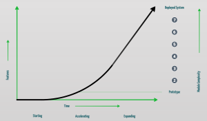
Just like a customer only hears the dollar amount when you give an estimate no matter how you qualify it, customers rarely comprehend the shell you are demonstrating to them in your prototype demo. Because, “How much longer can it possibly take if I can already see x, y, and z on the screen?” I have learned to display a complete project progression graph along with a prototype. You can see an example of one below. This does not solve the problem, I know I will still be asked later. But I will be able to refer back to a visual description that shows just how little of the project is done to generate the prototype. It is very important to not just have said the words, provide a visual that is stamped in their memory along with the fancy eye candy you are showing them in the prototype.
You cannot avoid tension from a well done prototype. Remember, a successful prototype will excite your customer, it will demonstrate for them the direction you will take in solving their business problem: how you will fulfill the promise you made by accepting the project. Just do not be naive and think there is no risk with a prototype because there certainly is. In fact I have watched it derail multiple projects over my career.
Another thing you learn about prototypes as you gain experience is to temper what is included. It is often tempting for the younger tech designer to want to show their full arsenal and impress the client. A prototype needs to be a very intentional and calculated deliverable just like any other. Filter what you show them by understanding your goal. Make a prototype purposeful, this can mitigate an unexpected consequence later. One example is when you find out the CEO was focused on a specific secondary graphical element that got nixed early on in the project. You do not want to be explaining why his favorite thing is gone because it was included in a poorly thought out prototype.
The message is to not let your guard down. A prototype, like any other aspect of your work needs to be done with a high level of precision. Prepare your prototype like you would any other feature, with intentional goals and outcomes. A defined set of criteria can make your life much more pleasant later.


