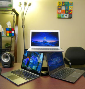
I have written hundreds of articles and dozens of reviews over the years. I can honestly say that reviewing the Toshiba 13” FHD Chromebook 2 has been the most difficult. The difficulty has arisen from a number of directions. On one hand Toshiba has directly addressed many of the gripes chromebook users have had (IPS display, 1920×1080 resolution, battery life). On the other hand there have been some very questionable choices such as materials and build quality. Because of the positives, there are only two chromebooks that can even be compared, the Samsung 13” FHD Chromebook 2 and the Pixel. The first makes good sense, similar price, features etc. Comparing to the Pixel has been an adventure. I will explain more as we walk through the review.
 I have created a unique comparison approach for this review. I feel confident I can efficiently and effectively contrast the Samsung and the Toshiba. In each major category I can clearly identify a winner. When comparing to the Pixel, outside of battery life the Toshiba always loses, so I pondered how to effectively communicate the comparison. I have chose to identify a percentage of the Pixel’s excellence that the Toshiba achieves.
Processor
Samsung vs. Toshiba – Tie
Toshiba vs Pixel – 75%
Using the Bay Trail processor for a few weeks was a great way to compare with the Samsung ARM processor I used for over a month in Europe on a daily basis. I have really gotten a very good feel for both, to use for real work over time, and they perform similarly. They are both a step slower than the Pixel or other muscular Chromebooks like the Dell or Lenovo. This step down was NOT severe enough to bother me in any substantive way. Sure, a pile of tabs opened simultaneously will take a second or two longer. This is not really important to my productivity. As memory seems to affect things more (all 3 had 4GB of RAM) on Chrome OS, I found productivity to be strong with the Toshiba. Given the way Chrome OS is developing I do not expect it to become a problem in the future.
Other ChromeOS Articles:
Samsung CB2 11 & HP 11, Better than the Dell?
How Does Samsung’s CB2 13 Really Work?
The Cloud Life, Backups are for People Too
Octane 2.0 using the latest stable release (38.0.2125.110 (64-bit))
Pixel – 20488
Dell 11 – 11680
Samsung CB2 13 – 6904
Toshiba CB2 13 – 7517
Some notes on the benchmarks. While you can see my rant on benchmarks here, it should be noted that the four Chromebooks all have very different processors in them. I can honestly say that the experience with ChromeOS does not drop off much moving between any of these devices. When looking at the range of scores it appears there should be on the surface. I would continue to argue that memory is far more important to a smooth Chrome experience than processor speed.
Screen
Samsung vs Toshiba – Toshiba in a landslide
Toshiba vs Pixel – 80%
Both the Samsung and the Toshiba have Full HD 1920×1080 screens. This is where the similarity ends. The Samsung uses a TN display (circa 1990’s) while the Toshiba employs an IPS display which has become the norm in the last decade for displays used by reasonable humans. An IPS display is simply required for outdoor use and I have been stunned that it has taken this long for them to start becoming standard on Chromebooks. My theory is that manufacturers made millions of TN displays for Netbooks a decade ago. These displays have been sitting in a warehouse all this time and they figured they could dump them on a platform they thought likely to fail and make a few bucks. No facts to back this up, just a theory.
The Toshiba screen is quite nice. It is sharp, the colors are correct, and the viewing angles are very good for a laptop at this price point. The only real negative is the lack of a matte finish. The glossy, glassy nature of the screen makes outdoor use more difficult. Not as poor as the Samsung but a headache-generator to be sure. I am writing this article in direct sun at the moment. I will be pausing for a while after this section because of the glare and the associate headache that is starting.
Comparing the Toshiba screen to the Pixel is interesting. Next to a display like the Samsung’s the Pixel looks fantastic, next to a good display like the Toshiba you really see the excellence. It was very similar to when I compared the Pixel to a Macbook Pro. You simply had to say wow. I still have not seen a laptop screen at any price that is better than the Pixel.
The format was interesting to contrast as well. The 16:9 aspect ration of the Toshiba is quite different than the 3:2 aspect ratio of the Pixel. Both can provide side by side windows effectively but the Pixel offers much more height. I think the 3:2 aspect ratio is superior in screen sizes over 15” while 16:9 provides the needed width for multitasking at smaller form factors.
Chassis
Samsung vs Toshiba – Samsung in a landslide
Toshiba vs Pixel – 20%
Toshiba DesignUsing the Toshiba CB2, feeling the materials and looking back at recent product lines, I cannot help but scratch my head at the awful designs Toshiba comes up with. I have become truly curious what broken process is yielding such poor results on top of very well executed engineering. I get the feeling that as a company, Toshiba would sit down at a five star restaurant and order a Mountain Dew and a plate of chicken fingers. There seems to be a lack of any sense of class at all.
For example a few years ago we needed a laptop quickly. My partner went to the local Micro Center and picked up the most powerful laptop he could. He picked up a high end Toshiba machine we labeled “racing stripes” for its big, gaudy red stripe and liberal use of chrome in the chassis. This unit would embarrass most high schoolers, it was so obnoxious. Mercifully the unit died but left a strong impression on us.
The Toshiba CB2 is similarly lost in terms of design. The outside cover is presumably inspired by a waffle iron. There is also one advertisement on the unit that cannot be removed–for Skullcandy of all things. Why would I want a nice Chromebook that I use every day, and which would appeal to businesses and institutions, to constantly associate with a brand like that? Absolutely goofy in my opinion.
End of rant…
I know I am going to be criticized on this rating. I have this simple proof to offer, we ordered three of the Toshibas, and two of them have had build issues. One of the units has had all but two of the screws fall out of the bottom. One of the other units has a piece of paper (shown in the picture below) sticking out from behind the screen.
Then there are the materials used to make the devices. In my review of the 13” Samsung CB2 I lamented the use of cheaper materials than the 11” CB2. Here I can tell you that the Samsung is made of far better stuff than the Toshiba. I think Toshiba chose the worst materials I have seen on a Chromebook and possibly on any laptop I have ever used from a name brand manufacturer.
The issue was simply amplified in my week long alternation between the Pixel and the Toshiba. I was reminded by the starkness of what my eyes were beholding, the Pixel is still the best laptop made in my personal opinion. Yes, most people lament the Pixel as an overpriced idiotic exercise, but it has been a wonder in my heavy use. By contrast I was constantly irritated by the chassis (color, texture, etc) every time I switched back to the Toshiba.
The only positive I found with the chassis design was the lightness of the device. Likely because of the cheap materials the Toshiba is a breeze to carry around compared to the other two. I have no idea what the spec sheets say, the device simply felt the lightest in regular use.
Keyboard, Trackpad
Samsung vs Toshiba – Toshiba
Toshiba vs Pixel – 90%
When it comes to the keyboards all three of the devices have excellent feel and sensitivity. I can easily touch type my way around without any loss of productivity or consistently missed combinations. These are all first class keyboards, the Pixel uses obviously higher end materials but this does not affect the performance of the other two.
I am beginning to wonder if there is a “Keyboard Czar” at Google that oversees all the input devices used on Chromebooks. I am seeing a very nice consistency and quality in all the Chromebook keyboards I use. A big pat on the back is deserved to whomever drove the manufacturers to use decent keyboards instead of the awful stuff you see on many cheap Windows laptops and netbooks.
In the touchpad department the devices are close, but the Pixel and the Toshiba are simply better. The surface might not hold up as well as the Pixel over time (plastic vs glass) but it feels fantastic. I also like the click pressure required on the Toshiba best of all the devices. It is very natural and superior to even the Pixel in constant, all day, use.
Battery Life
Samsung vs Toshiba – Tie
Toshiba vs Pixel – 200%
Everyone knows the Pixel has barely passable battery life. This is partly why it is my “roam around the house” device and not my “go everywhere” Chromebook. The surprise was the equality in battery life between the Samsung and the Toshiba. I expected the IPS screen and Intel processor to cause the Toshiba battery to be shorter-lived than the Samsung. It was not, it was fantastic. In my travels the last couple of weeks the Toshiba could go all day with heavy use. I rarely worried about the battery, and it charged very quickly. By contrast the Pixel runs out of juice by lunch and takes the rest of the day to charge!
Conclusion
Sorry to disappoint but the Pixel is still king, even when compared to the latest MBP from Apple. The Toshiba did not best it.
BUT, the Toshiba is an easy recommendation despite the chassis irritations because of the price and the screen. You simply cannot find a better balance if your focus is not on looks. In weeks of use I could not find any real flaws in the technical execution of the device. It is a very effective tool and I ultimately make my choices on this basis. I will be retiring the Samsung after a short stay in my arsenal and using the Toshiba as my primary Chrome OS device
I give the Toshiba a strong recommendation, I have not seen a better low cost device. As successful as it has been so far, I expect other manufacturers to follow suit and end this silly use of antiquated, awful displays.

