
This is another excerpt from this summer’s 31-page intern project report (PDF). All of this was written entirely by our interns, with only some editing feedback from professional Oasis Digital developers or managers.
System Design
Client
We used Backbone.js to organize the client into views, models, and collections which were handled by a built-in routing system. We created four main Jade files: desktop, tablet, phone, and main. The main Jade file loads all of the CSS and JavaScript. We then implement Jade’s “include” feature to include each Jade file for the different layouts. Each Backbone view has a template of HTML associated with it, with a different version of the template being stored in each layout Jade file. There are Task and User models with collections for each type of model. We decided to use two different collections for tasks: filtered and unfiltered. The filtered task collection has a cut-off size which is specified in the config.js file. The filtered task collection is filtered by the user’s selection of the input fields on the sidebar of the home or manage pages. The unfiltered collection contains all of the tasks in the database that the user has access to view. In order to use jQuery Mobile, we had to disable its routing system. Each time the user clicks to change pages, the body of the DOM is replaced with new HTML that is loaded using Underscore from one of the templates from the Jade files. Backbone utilizes a hashtag in the URL, making Cerberus a single-page application. Backbone includes a RESTful interface for interacting with the server which is handled behind the scenes, minimizing our usage of manual AJAX calls using jQuery. The client code is largely the same between the layouts of the application.
Desktop
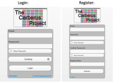
Login:
The login screen includes a logo with a background of the home page of the app. The email input field checks for a valid email. The password field includes a button to toggle the visibility of the password, which makes typing passwords easier on mobile devices. A select menu allows the user to select which type of interface they would like to use. The user’s device type is automatically detected and the most suitable layout is pre-selected. The width is optimized to be about a quarter of the screen in the middle on a tablet or desktop and fill up the whole screen on a phone.
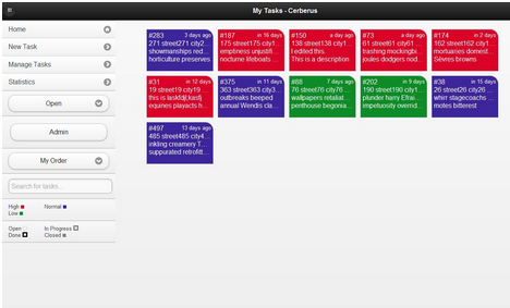
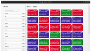
Home Page:
On the left side of the screen is the navigation pane with a button to toggle visibility in the upper-left corner. The pane includes links to all of the pages, the filtering/sorting controls for the current task collection, and a legend for the group of tasks located in the main part of the screen. Each task div is placed on a corresponding underlying grid of invisible slots composed of divs of the same shape and size as the tasks.

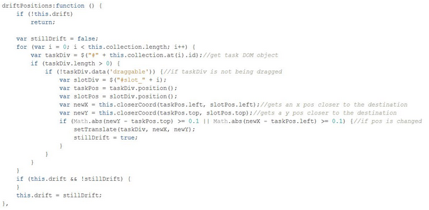
Here is part of the source code that makes the tasks drift when a task is being dragged:
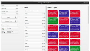
Manage Page:
The manage page allows managers to reassign a task to a different user by dragging and dropping a task onto a user in the list on the left. The count bubble indicates the number of combined open and in-progress tasks for each user, and the check or x next to each name indicates if the user is logged in. A manager may also click on a user from the list to edit the attributes of the user. Hiding the left sidebar is extremely helpful on this page because it allows the user to see more tasks. This layout along with the home screen had to be changed drastically to keep the functionality on the phone.
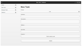
Add Task Page:
The add task page is a typical submission form styled with JQuery Mobile.
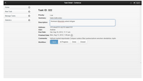
Task Edit Page:
The edit task page begins as a table with labels on the left and content on the right. Once a user clicks a detail of the task, the data becomes an input box or some other user input such as a select or checkbox as appropriate. When a user clicks out of a field or presses enter, another function is called to validate the model, changes the display of the screen with the new information, and saves the changes to the database.
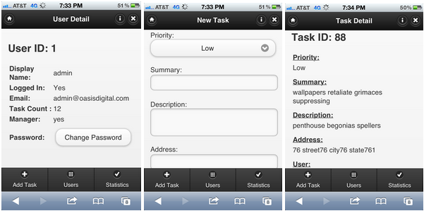
Edit User Page:
This page is similar to the task edit page because each field changes on click, validates, and saves on loss of focus. One of the differences is that the edit password field displays two entries to require the user to enter their password twice for verification. These fields also use the same requirements and validation as the password fields on the register page. In addition to being able to reach this page for each user from the manage page, each individual user can change their information by clicking the “i” button in the upper right corner next to the logout button.
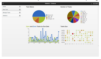
Statistics Page:
This is a page of graphs inspired by JIRA and the Beebole dashboard to show the practical usability of allowing managers to see how their company as a whole is functioning and keeping up with or falling behind demand. The upper left pie chart shows the number of tasks based on a status of open, in progress, done, and closed. The upper right pie chart shows the distribution of “todo” tasks, all tasks either open or in progress, assigned to a given user. The bottom left line-chart shows the number of tasks due on a given date both 15 days in the past and in the future. The green line denotes tasks with an open status and the blue line indicates a done status. The bottom right “dot” chart shows the number of tasks that are going to be due at a given hour within the next seven days. Some difficulties included timezones for displaying the dot and line chart and rendering well across all platforms. This uses gRaphael.js and renders the graphs on canvas elements. This page is the same on a tablet and the charts are in a column instead of a table on a phone in order to effectively using screen space.
Tablet & Phone
Our main goal for the mobile versions of the Cerberus Project was to make the application look and feel as native as possible. To do this, we tested the application on many devices. These devices include the iPhone 3GS, iPhone 4, iPhone 4S, iPad 2, iPad (3rd generation), Samsung Galaxy Nexus, Samsung Galaxy (1st generation), and LG Optimus. We found the application to run noticeably faster and smoother when using the Chromium browser. In order to facilitate part of the mobile experience, we attempt to detect the user’s device using a JavaScript library called DeviceDetection by Daniel Pötzinger, and then set the select box on the login page to be the most suitable layout for the user’s device.
Tablet:
There were very few changes required to make our original layout work well on a tablet. Words were cut off on the sidebar on seven-inch tablets and as a remedy we made the width of the side bar marginally higher and the width of the content div marginally smaller. One unresolved problem with certain seven-inch tablets is the content is sometimes displayed below the sidebar. This is a problem with the width of the sidebar div and content divs combined being too wide for the screen resolution.
Phone:
In order to maximize the usage of small screen sizes of mobile devices, we needed to change how our home tasklist page was displayed. The team decided to adopt a native mobile-themed approach, so we implemented a jQuery Mobile listview to display the tasks.
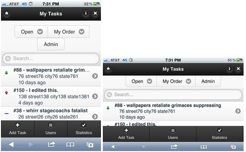
The only major difference in the page-organization that is unique to the mobile layout is the addition of a userlist page and removal of the manager page. The team felt that there was not enough screen space to efficiently implement a manager screen for mobile devices. Instead, a manager can access a list of all users. From this page, the manager is able to see the number of open or in progress tasks assigned to each user. The task reassignment feature that is available from the manager page on a desktop is unavailable for mobile devices. Instead, a manager must manually edit the user from the task edit page.
The rest of the mobile layout is almost exactly the same as the desktop version. There are minor changes in the styling and layout of content on the task detail and edit pages.
What We Learned – List at least 3 main concepts. Describe your perspective prior to the project and the difference now. List some things that you did not even consider important previously that will help you in the future.
This is the end of the excerpts we will blog – for the whole story, scroll up to the top of this post and download the PDF report. It has been a pleasure working with these interns, and seeing the completeness of their work. -Kyle