Strategies for successfully traversing the ever shifting Atlassian UI
Atlassian’s JIRA is a fascinating platform for me to use, teach about, and study. I have been working with computers since I was a child in the 80’s. My parents did not buy an Atari game machine when they were popular, we bought an Atari 400 computer. I did play games, but I had to type them in from the back of Byte magazine first.
To those who understand that last reference, we are few in number but we understand why so much works the way it does today. As I keep my eye on staying current in this field, I watch what develops in the context of the full path of the personal computer (pun intended).
In many ways, the fluid JIRA interface is a triumph of SaaS over the technical lethargy that typically comes with enterprise software. The application rapidly improves in any area the company focuses on. Missteps in design are sometimes corrected surprisingly quickly. Soft launches of new features are incredibly valuable, the new project interface is a perfect example. With the first soft launch it was horrid, now it works pretty well. With hundreds, and possibly thousands, of talented developers working on the application, the scope of the management problem is hard for many to fathom. It does yield some interesting results.
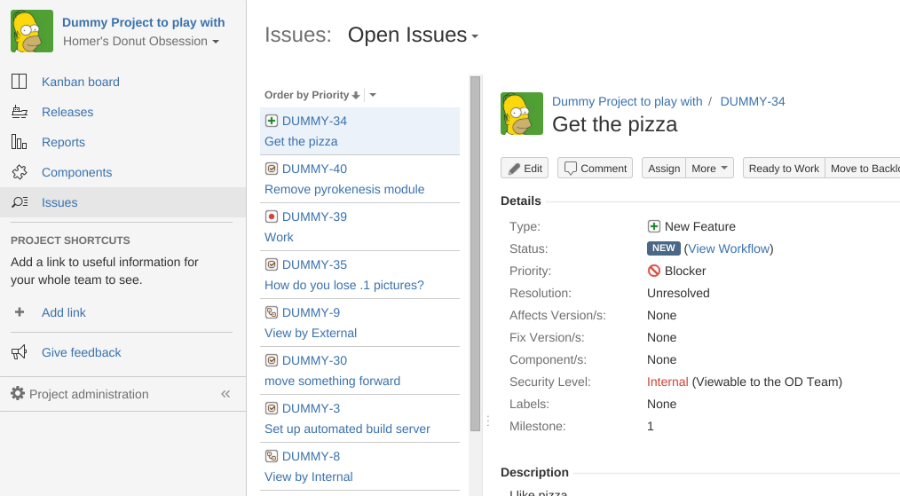
Over the last few years there have been various waves of updating the UI in JIRA and other Atlassian products. I currently see four concurrent waves of UI modernization in JIRA. I am sure some of them will not expand much further but disappear, although not without creating potential confusion for users.
This challenge hits us directly in almost every class I teach. I will regularly run into a UI change that occurs during the class or while I am traveling to a class. This leads to some interesting results when, for example, you are setting up a project and end up in the administration pages without warning. It keeps you on your toes as an instructor.
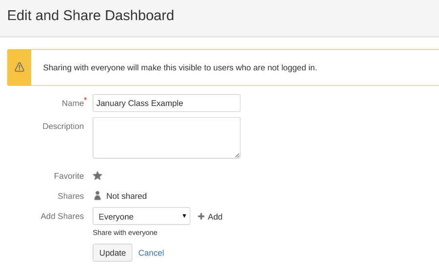
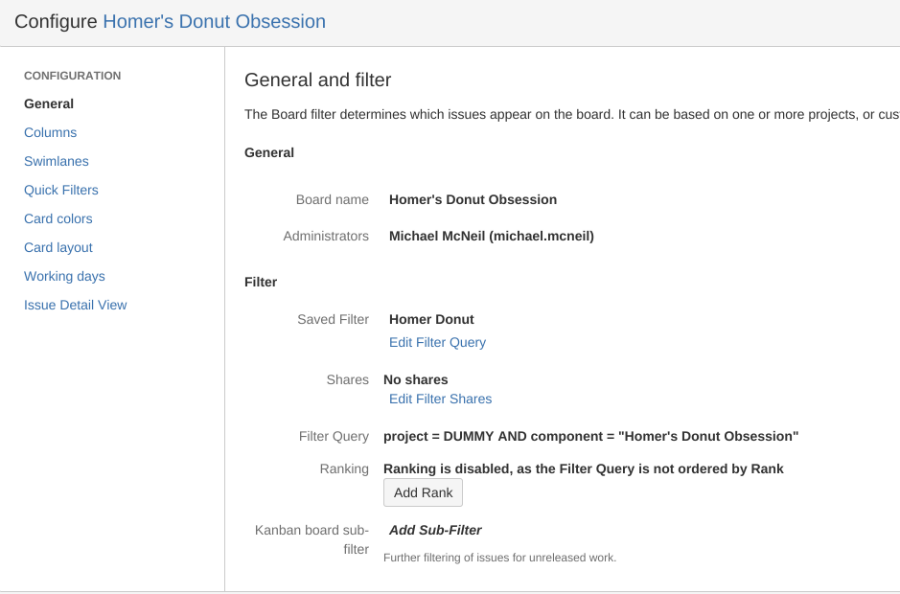
Above and below are two very different examples of interfaces to share something you create with other users.
As a prime example, many more can be found in the images throughout the article, lets look at what users manage in the system. They manage Dashboards, Filters, and Agile Boards. The important features for users are creating, editing, sharing, showing favorites, these are just a start. Yet when you compare the UI mechanisms for all three, it is very rare for the three areas to work the same way. This simply confuses users.
From my perspective, there are three types of organizations using JIRA Cloud.
- Enterprises
- Mid sized organizations
- Small teams
Enterprises
If an Enterprise is using JIRA Cloud, they are progressive by definition. Many Enterprises could simply not overcome the internal hurdles to use an app outside of their physical control. Even a dynamic company of this size will struggle with organizational weight and will need support to keep users productive.
A key strategy I have seen implemented in this type of environment is to have a designated advocate in every organizational unit. Connect these advocates together and give them a steady flow of release notes regarding UI updates. Very quickly these staff become the first line of support for users that need help. Over time they can proactively address new updates for people they work with every day. This is more efficient than asking a training organization to hold boring classes devoted simply to UI changes, that are reminiscent of Office Space.
Mid Sized Organizations
Organizations in this size range often have less defined processes, and may not have a dedicated support team for software. Very often the IT department fills this role. Often individuals that can have very disparate job titles become the “go to” problem solver for a part of the organization. Find and recruit these people, they like helping others or they would not become that person. Empower them and let them help you.
Another approach is to use your normal notification mechanism (possibly the one built into JIRA) to notify staff of changes to the interface that will affect them. Proactive communication, if consistently delivered, can build confidence and improve productivity.
Small Teams
Teams that are using JIRA Cloud are a much simpler scenario. It does not mean that less diligence is required to keep your team productive, but the approach is different. Watch for those that are getting behind, talk within the team at lunch or during meetings about changes.
My software teams fall into this category. I try to be aware of the various generations in the teams and anticipate problems. A perfect example is Windows 8. As I watch people use it, I see a clear divide between those that use the Metro interface vs those that avoid it at all costs. This does not mean users are less capable, they have had different experiences. Instead of ignoring this, use it to your advantage. It will increase your knowledge and improve the cohesiveness of the team.
Final Thoughts
This article was written about JIRA but it really applies to all kinds of software and systems. The consistent theme here is proactive communication. None of these strategies involve one person trying to solve every problem. Engage others, increase knowledge transfer, and build consensus. These are strategies that work in many situations and circumstances.
The rapid development of new features is one of the reasons I strongly advocate for JIRA software in many situations. Atlassian has done an amazing job building up the capabilities of the system at scale in a fairly unique way. The uniqueness of this is often unexpected to users and hopefully the strategies discussed here, or some variation, can help you keep your team moving forward for many years to come.
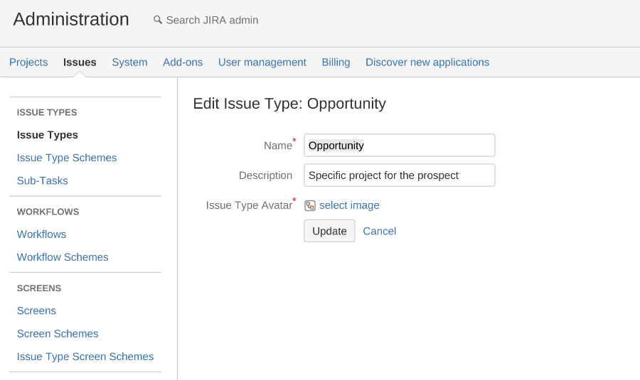
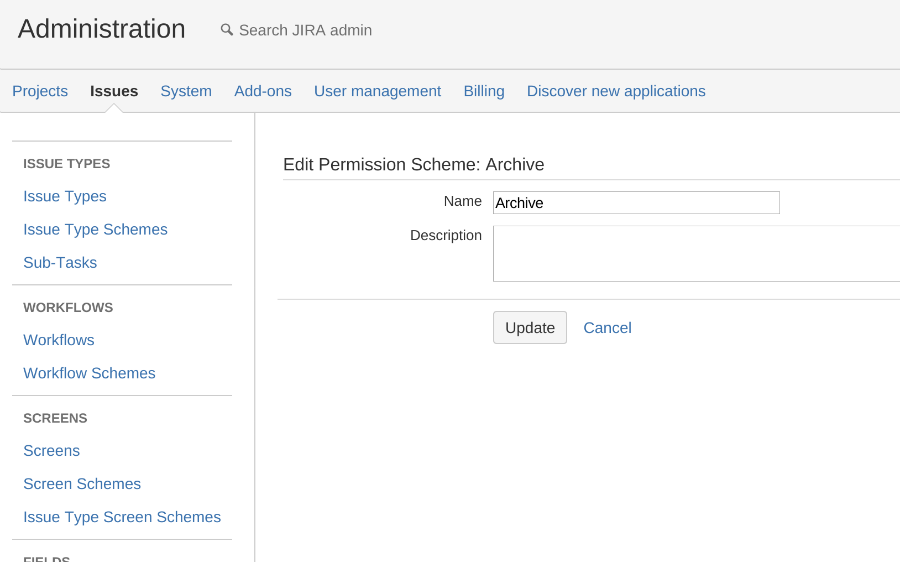
Here is another example of UI differences within a major function of the application, editing a name.

