Often I describe JIRA as a large set of Legos in a bucket. JIRA is one of those tools that is so flexible it is hard to get your head around how to use it.
The Lego analogy works on many levels. Using the predefined project types, JIRA Agile, JIRA Service Desk, etc is like opening Lego kits. Yes, they still include regular legos, but the fun stuff only works when it is built in a certain way, and will only make what someone else imagined. While working with the standard block shapes you can put together almost anything you can imagine. With this in mind, there are three main components of JIRA that make up the core building blocks of a system: issues, workflows, and filters.
Every feature in JIRA revolves around one of the three. I want to focus on filters and their broad impact in JIRA. It is incorrect to think of all the issues in JIRA broken up into projects because this is simply not true, even a project is simply one filter of the greater issue store. All the issues created in your JIRA instance are in the same bucket. When JIRA moves to display items to the user it first looks to see what subset of issues this user has permission to see (regardless of project), and then shows the list based on the filter being used at the time.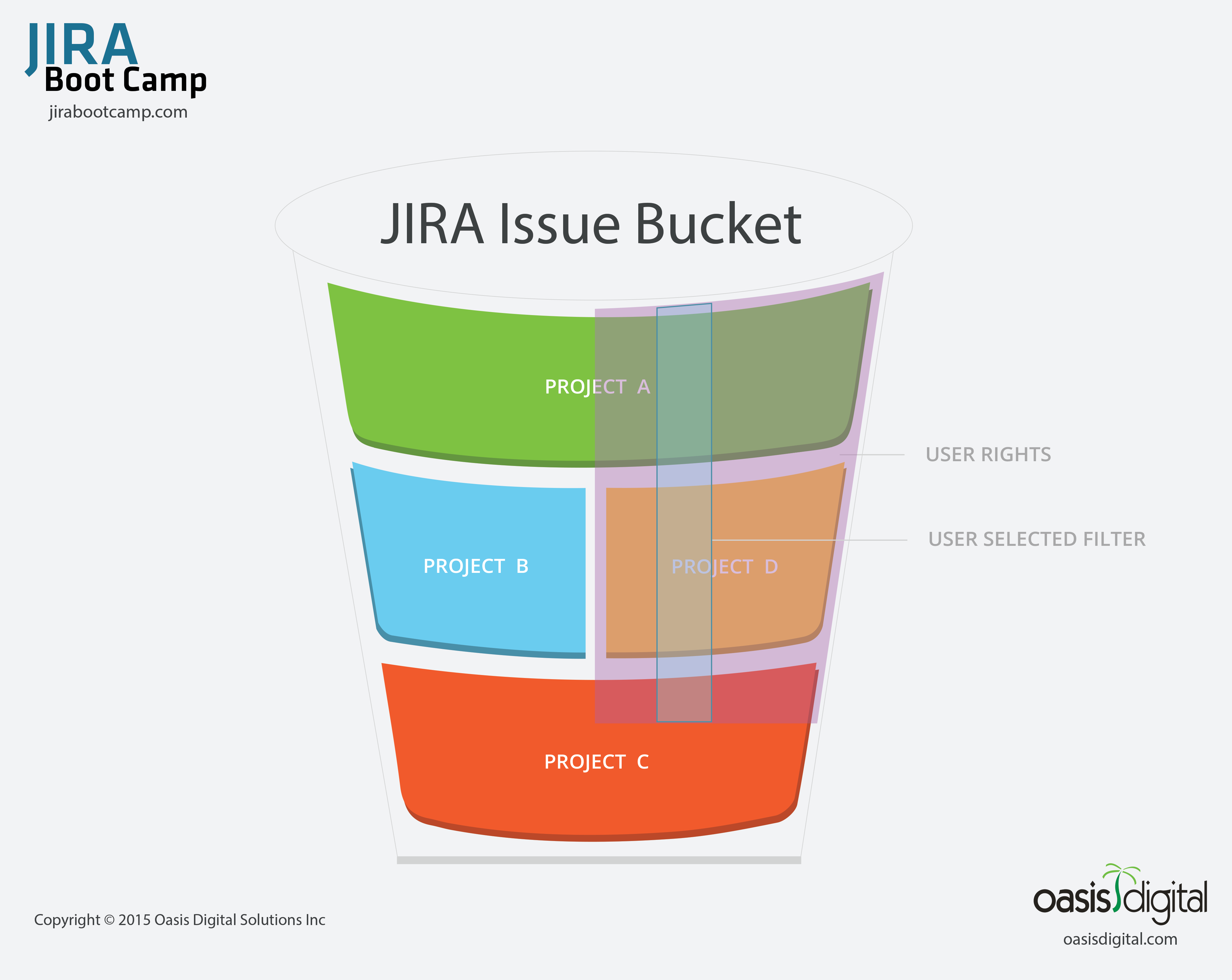
A good way to think of this concept is the diagram included here. There is the larger issue bucket of the whole instance, and individual users can see the issues that span the projects, issue security, and permissions given to them. They are then able to apply filters within that cross-section they have rights to.
Filters are used for all Reporting, Agile boards, Dashboard Gadgets, Wallboards, API calls, and of course filtered issue lists. If you are looking at more than one issue on your screen, filters are at work.
Once you grasp this idea you can really start to use filters in a powerful way. I often see the light bulb come on in either day 1 or day 2 of our JIRA Boot Camp class. Users will often say, “So that is why <insert situation here> happens!” and then they will be empowered to fix some long-standing problem that has caused frustration with JIRA.
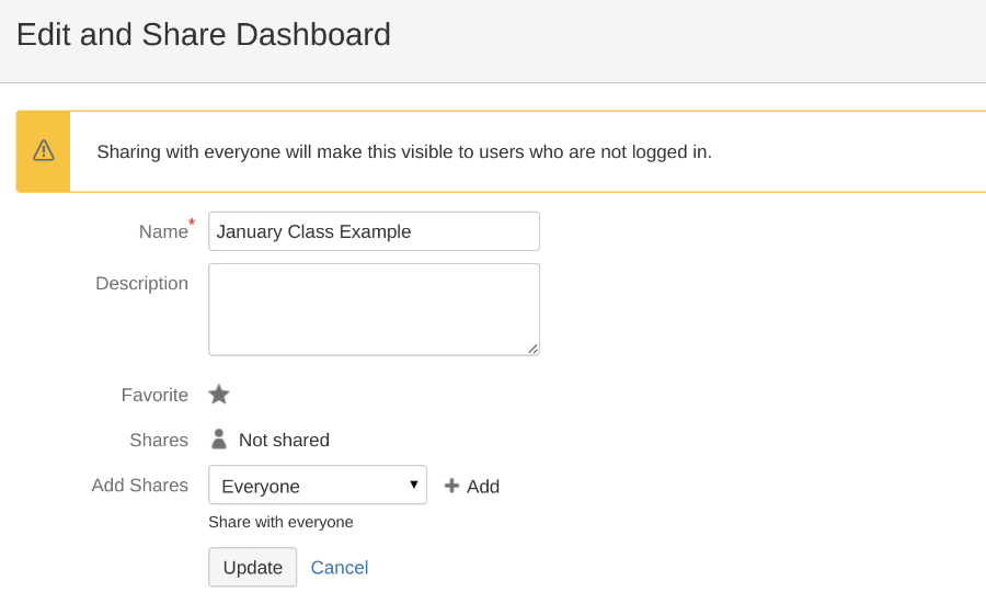
An important aspect of filters that is often overlooked is sharing. The lack of understanding runs across a wide spectrum. On one end people struggle with the idea that users cannot see a particular Agile board or a gadget on a Dashboard without having the necessary filter shared with them. Often in these environments the company is only organizing everything at the project level. These are also often the companies that only use the built-in issue types and avoid customized workflows. They will find it hard to have desired data and functions available where users need it.
The other extreme is the system where everyone automatically shares every filter with all users. In this situation people can easily get frustrated by having hundreds and sometimes thousands of filters to deal with. Over time the list just gets larger and larger as employees come and go within the company. Imagine if an average employee has 25 filters and the company turns over 100 employees per year. In two years you could have 5000 abandoned filters in the system.
It does not help that the interface adds confusion to an already complex idea. in the words of Inigo Montoya:
“You keep using that word, I do not think it means what you think it means.”
On the main filter page is this big, obvious button that says “Share”. This is not actually how you share a filter! You must click into the less obvious “Details” hyperlink and add permissions to the filter. I do hope this gets fixed soon by the removal or re-purposing of the share button.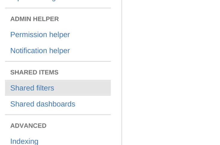
Neither of these extremes is actually necessary. The proper balance is to have an intentionality to sharing of filters and an administrative discipline to curate the issue list in the System Admin area of JIRA. See the image shown. In this area an admin can delete abandoned filters and change ownership of important ones. Keeping this list manageable is simply good JIRA hygiene.
Filters are a core building block of JIRA. Understanding them and guiding your users to apply them properly can dramatically improve the user experience.


 In every task within every job there is a context, and a certain set of information that is needed. System designers have learned to present the information the user needs at a particular point in the work process. There are many mechanisms in a JIRA workflow to assist with this. The most powerful is the idea of screens associated with transitions in a workflow.
 Pride of authorship can be devastating to a system. Every organization is different, and your users matter. Listen to them and iterate on your workflows. Provide a mechanism, often another JIRA project, where users can make suggestions. Ask your users to critique screens and provide feedback about ways to improve their productivity.

 I read a lot and I see lots of commentary on agile software development. In many of the discussions the dialog is often very detailed, laced with procedure and process. This style of explanation leads to reactionary implementations that may not be well thought through. These implementations are like a thin coat of paint on a hard surface. It looks pretty but it does not go very deep. Companies that go down this path usually have a history of other such implementations of new ideas. Employees are used to it and respond with a surface change that only lasts until the next idea comes along or until nobody is looking.
 As much as I like the agile way, I love the