FlashFiler to RDBMS Data Converter

Transformer_Flux.svgOur work at a Oasis Digital often includes migrating legacy code or data into a new system. We often find off-the-shelf tools, or create ad hoc single use tools to assist that process, but occasionally something reusable emerges.

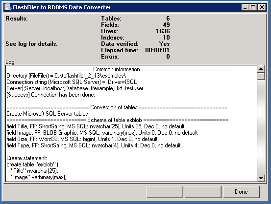
We recently needed to convert a lot of data from a legacy FlashFiler database (an Turbo Pascal then Delphi specific database from the 1990s) to something more modern. We took the opportunity to make a tool for this purpose outside of any specific customer project, so we are able to release it for anyone to use. It looks like this:

ffrdbms4

We have released this data converter as open source software. You can download it, or learn more, on its page on GitHub.


3D Configurator Intern Project

One of our specialties at Oasis Digital is in rules-based configurator systems of various types. For example, we have worked on complex model number configuration systems, quotation systems with complex sales commission rules, graphical system of configuration widgets, and other similar tools.

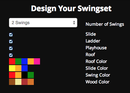
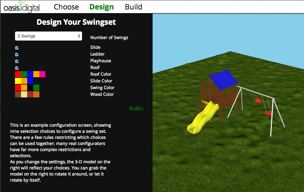
For our 2013 intern program, one group (led by Zach Kimberg) worked on a 3-D rules-based configuration system. This project lasted about half of the summer, and got far enough along to produce a visually interesting demo, shown below. The screenshot doesn’t really do it justice – it is dynamic and continuously moving.

swing-set-snap

This works entirely as a web application, with no use of flash or any other plug-in. It relies on WebGL, built-in to most modern web browsers. It is coded entirely in JavaScript, with help from AngularJS for the user interaction and Three.js for the 3-D model management. The 3-D model is hacked up and simplified from a 3-D model example from a website we have forgotten.

3d-config-still

We see this as a proof of concept showing that it is possible today to build complex rules-based configuration systems, with a rich visual display, that run easily in a browser. It is no longer necessary to build difficult-to-deploy desktop software for this type of need.

Update: We recently added this short video demo of the configurator. Unfortunately the video doesn’t show the rules in action – there are rules to block certain combinations of settings in the configuration. The video shows a slightly jerky rotation of the swing-set – in the live software, it is completely smooth. Enjoy:


RE: Design/UXD Conference Day 2, San Jose 2013

Day 2 in San Jose, and I need to give the same disclaimer as yesterday.

“You can find more information at the conference website (http://www.redesignconference.com/). I will run through the sessions and attempt to communicate those points I found especially poignant. Much of this will be iterative, in that the presenter had a point, I may have heard it as they intended it or applied my own analysis to it. Either way, I should qualify that all of these ideas are not mine but at the same time many of these ideas were not the presenters’. That should be clear as mud!”

What We Can Learn from Disruptors – Carrie Whitehead – Zappos

What We Can Learn from Maps – Eric Rodenbeck – Stamen Design

What We Can Learn from a Voter – Adam Stalker/Daniel Ryan – Obama for America

What We Can Learn from Gaming – Christina Wodtke – Publisher, Boxes and Arrows

The Experiential Difference – Jesse McMillin – Virgin America

conf_uxdThe story of Netflix and Blockbuster are a cautionary tale for any business. 5 years ago Blockbuster was in excellent financial position, expanding markets, a solid business. The markets and Blockbuster scoffed at the upstart Netflix and its business model. The truth was, complacency had invaded Blockbuster and today they are bankrupt while Netflix, despite missteps, is growing and positioned well for the future. The moral of the story is incremental improvements to business are important and powerful but CANNOT substitute for innovation. We need to look ahead, see patterns, see opportunities, and innovate.

We need to design for one task to touch many channels. Retailers like Amazon have to consider this. Users might browse on a tablet, phone, pc or tv. They might review products on the tablet and complete orders on the pc. They might manage gift lists from their phones or make media purchases there through apps. They might stream movies on their accounts from their TVs. All of these are part of a single task arriving from multiple touch points.

Quick technology geeked out moment and an example of good design: I am editing this post on my Chromebook Pixel. I have my notes open in Evernote in a window to the left of my editor. I can scroll in the Evernote window by placing the mouse over the background window and moving two fingers on the touchpad. I can do this without changing focus from my editor. I can scroll in Evernote while typing in my blog editor. Excellent design!

bigstock-Infographic-elementsMapping data sets is both an old discipline and one that in many ways is brand new. Over the millenia maps have been key to many things. They told stories about the land they described. Cartography is collected as a highly prized art form. Maps today have been reduced to a simple tool. Very little depth is present. Sure, you can make it look different with the treasure map layer on Google, but there is not a story there.

When we consider data in various systems we can choose to look at the numbers in tabular format or visualize data in graphs, charts or tools. If we take this a bit further and “map” the data in multiple dimensions, unusual patterns are visible, new questions are raised, and a greater understanding of the data is possible. The human interface for interacting and exploring this data still needs to be developed. Hollywood has its ideas, and we all know how realistic that is. It is clear that we are very close to being able to tap into historical data at a level that was impossible previously.

When we do map data there is an opportunity to return to the storytelling of mapmakers of old. We can intentionally weave a manager’s job description in how the data is presented and manipulated. We can provide the “rest of the story” to a busy executive wondering how effective his workforce is many levels of management isolated from him. We can empower users with predictive inputs to help them make wise decisions in their businesses.

Big data no longer means collecting snapshots, it means collecting everything. The election in 2013 was an unprecedented opportunity to both track and influence social networks. The Obama campaign partnered tightly with Facebook and Google to provide daily inputs that directed the campaign. Every night 66k election simulations were run and analyzed, data was constantly challenged and tested, and changes in strategy were implemented. They had deep access to millions of voters’ data, during an emotional election season, with a crescendo of activity culminating in the election. What a researcher’s dream.

One use of social media was really surprising to me. The campaign had a list of undecided voters. They mapped those voters on Facebook in many ways. What photos were they tagged in? Who were they friends with? Who did they share with? Where did they live? Then they would measure the influence of their supporters with those voters using the same metrics, and score the “influence factor” of that supporter. Then they would send messages from the campaign giving supporters instructions regarding who to talk to. By this method and the election day vote efforts they estimate they swung 5 million voters nationwide. This is greater than the margin of public vote victory for the president.

American politicsTwo other efforts, “The Life of Julia” and the explanation of Obamacare were both very successful. On both of these initiatives 75% of the users stuck through the application all the way to the end. This is a very high retention rate. The Obamacare app moved people through the legislation from 4 different inputs, through 500 paths, to 8 conclusions. Both of these applications flowed against the resistance we have to clicks in design.

One last conclusion from the campaign discussion was the way they drew people into donating. The entrance page for donations was very simple, the user simply selected an amount. There was much information that needed to be filled out but the user was not presented with this until they decided to give. The user rarely backed out once they made that decision. They found this far more effective than the past approach of presenting users with forms prior to the donation moment.

Game designers identify user types when building a game. These consist of killers, achievers, socialites and explorers. Another list is expressers, competitors, explorers, and collaborators. There are similar patterns at play in a business when interacting with their enterprise applications. Executives, managers, workers, and administrators all have similarities in both personality and job description to these categories. If we map both personality and job against a category of user we can learn something about how to build an interface suitable for their use. It appears there is fertile ground in this area that could yield increased productivity.

In a media-cluttered world we crave things both immersive and memorable. We need to remember that when building systems. We cannot incorporate whimsy and humor in everything we do, but there will be opportunities to do so. Our users and clients will thank us if we do.

Now that I am through the conference I feel like I can put down the firehose and absorb this information. What a valuable experience, and a conference I would highly recommend.
RE: Design/UXD Conference Day 1, San Jose 2013

conf_uxdI am attending a two day conference focused on User Experience Design. At the end of the first day I can clearly say this was a valuable event even if every presenter tomorrow is really awful. You can find more information at the conference website (http://www.redesignconference.com/). I will run through the sessions and attempt to communicate those points I found especially poignant. Much of this will be iterative, in that the presenter had a point, I may have heard it as they intended it or applied my own analysis to it. Either way, I should qualify that all of these ideas are not mine but at the same time many of these ideas were not the presenters’. That should be clear as mud!

What Can Experience Designers Learn From Rock Stars – Tim Richards (@nanotim) – Blitz

Graphic Design and Branding – Andy Gilliland – Punchcut

What We Can Learn From Connected Objects Around Us – Jeff Devries – Motorola Mobility

Learning From James Bond, Experience Designer – Danny Sill – IDEO

What We Can Learn From a Bad Remodel – Steve Tatham – Disney Imagineering

Reframing UX Design as a Profession – Peter Merholz (@peterme) – Groupon

The discussion of group dynamics was very timely as I look at the development of my teams at Oasis Digital. We need to be able to work collaboratively and we need to work solo. A big challenge has been having that solo work fit back into the collaborative effort. We need a shared language to be consistent. Each team member learns to communicate within the team but continues to use that shared language when they work alone. If we push to stay consistent, then individuals can innovate within the language of the team.

We also discussed the need to have the core message down cold. When you know it inside and out then true passion and innovation can shine through. The best musicians will play a piece thousands of times so that they know it completely. That way when they perform they can meet the audience at the experiential level and communicate without worrying about the content. We should know our process and our message without hesitation. If we do that then we can meet our customers where they are and provide them with more valuable service.flow

We also need to guard against doing it ourselves. Those around us cannot learn if we do not teach them. This is difficult when faced with deadlines and requirements, but if adhered to then the benefits are substantial. In a modern organization we need to be flexible with the parts we play. There are no menial tasks or work that is below us, there is the team and a goal. The team members have a responsibility to all push toward the goal together.

When presenting an idea we need to speak with passion and honesty, we should not apologize for limitations. We need to put our thoughts and ideas out to the world. Good design has persuasive power and we need to master our craft.

There was also discussion about the need to separate the idea from the execution. I like the quote “save yourself from yourself”. Often we can be our own worst enemy and destroy our own ideas. We load them down with requirements and additional ideas which can lead to a loss of the original point. We should iterate on the execution (how the idea is realized), not on the idea itself.

Simple is often the best approach once the shared language of the team is established. You should be able to distill core ideas to fit on a bumper sticker. This is not sales, it is communication. This flows into another point that was made which was we should design for behavior instead of designing for information. The ways users are interfacing with information are distributed across platforms and devices. We should be looking at the behavior in each context.

When a music artist wants the audience to “go nuts” they “drop the bass”. This is a universal message that invites the audience to participate. You can hear this principle in much of the music played during warmups at sporting events. A lot of dance music will make heavy use of this idea as well. As designers we should “drop the bass” in our systems. No, we should not incorporate Dubstep into our designs, we should invite users to use our software. We can do this through emphasis, colors, and simplicity.

The merger of structural thinking and visual aesthetics is very important. We need to give content form and order. There is currently a convergence of physical spaces and screen spaces. A convergence of physical and electronic devices. We should start designing using good design principles and stop just putting the logo in the upper left.

Other design disciplines can teach us a lot. Industrial and Automotive design can teach us about feedback, the prioritization of information and sightless interaction. Landscape architecture can teach us about designing for space, considering flow and managing multiple user interactions. These are very important as we bridge the physical and the virtual. We can use these ideas to develop a consistent design experience that transcends interface options.

The way we store masses of information has changed the way we think and process. The way we use all of this input and store it outside of ourselves is a phenomenal change and we are only scratching the surface of its implications. We need to consider this change as we design a UI. Users today simply interact with applications differently than they did 5, 10 or 20 years ago. We will not be going back so we need to look forward.

We need to think from a systems perspective. We can learn a lot from systems that work (subways, ecosystems, beehives). We should not try to reproduce the same experience on different devices. We should make the experience make sense in the context of the use. This context changes between travel, home and work. There is a progression of interactions that is changing over time (keyboard/mouse > touch/voice > gestures/eye-gaze). These changes are additive, because we now use voice does not mean we stop using a touchpad or mouse.

Society keeps swinging between many devices and a singular multipurpose device. Not too long ago we all had phones, mp3 players, gps devices, etc. Now most adults have a smartphone and none of the rest. With the advent of the new physical devices (fitness tracker, smart watch, Google Glass) will these collapse into a singular device or will they have enough value on their own to persist?

Reverse mentoring can be powerful. Today, youth are coming in with skills and understanding that surpass those with experience in some very critical and narrow areas. Much like teachers had to move from being the knowledge experts in schools to guiding exploration by students we need to empower young coworkers to share what comes so natural to them. We need to adopt that role of guide to help them where they need it (most functional aspects of life), and not be threatened by their skills.

All developers should be concerned with the user experience. This is not the domain of an isolated team member. There is a shortage of designers so companies tend to use their design capacity for product execution and forget ideation and product definition. A good UX designer becomes a conductor and leader for the team. It is very easy for a team to get off the “good” path.

A Misunderstood OS

Pixel-300x300I have read a number of articles about Chromebooks, the new Pixel, and some of the implications of Google going up against Apple and Microsoft directly. I think there is a very important paradigm shift that I have not seen discussed to date. It is well known that as a Windows or Mac based machine ages it gets slower. Malware and bloated software like Microsoft Office all contribute to this phenomenon. Chromebooks, on the other hand, will get faster and more feature rich over time.This is a really understated aspect of the Chrome OS, likely because marketing types in fancy suits decided it was too cerebral of a concept to communicate. Even the brand new Pixel page in the Play Store only alludes to it in this paragraph:

Like all Chromebooks, Pixel boots-up in seconds and stays fast, requires almost zero setup or maintenance, and comes with virus protection built-in. Best of all, it stays up to date with seamless updates every few weeks.

Lets look at the following three scenarios:

  1. Tom needs a new laptop but does not want to spend a lot of money. He looks at what is available and settles on a $500 Windows 8 laptop at the local store.
  2. Richard hits up the Apple store at the local mall, he needs a lightweight portable computer. He really likes the MacBook Pro but common sense wins out and he purchases an entry level Air for $999.
  3. Harry needs a new machine as well. He uses mostly web based applications so he decides to give the $249 Samsung Chromebook a try.

We all know their experiences once they get home with these devices will be a little different. Windows is still a little frustrating to set up, Apple gets your credit card number immediately, and Google, well, you have to log in. Ok, that is a significant difference but not the point of this article.

Down the line 6-12 months is when the real difference will show. Over time, Microsoft and Apple’s operating systems get bigger, thicker and heavier. A machine purchased a year ago running last years OS X or Windows 7 will not run as quickly today on Mountain Lion or Win 8. This is simply a fact that has been true for decades.

Contrary to that, our Chromebook is faster and can do more that it could when we purchased it 6 months ago. There are certainly limitations. It is still not that polished editing things offline, file management is horrid, and niche apps are almost completely absent from the platform. In some ways it is really lacking.

What is exciting is that the list of negatives six months ago was 3X what it is now. This gives me the confidence that these other issues will be resolved also. The release of the Pixel as a high end computing device will require these remaining limitations to be addressed as well. The crowd that will spend $1300 on a cloud based computer will not put up with an incomplete device for long.

All this to say that I think my Chromebook will be more productive a year from now than it is today. NO OTHER PLATFORM CAN MAKE THAT CLAIM. This truth alone should make a difference for anyone buying a new computer. If you use a preponderance of online applications and very few monolithic programs I think the Chromebook is a compelling choice.

Interestingly one of the biggest reasons holding people back is a lack of understanding of this OS. Google has done a poor job communicating just how different it is. As writers continue to focus on processors, memory, storage size and other legacy PC issues, it misses the real value of the OS altogether. For example everyone is scoffing at the Pixel having 32GB of storage while providing 1TB of Google Drive space. As I have seen with my 16GB device, this is plenty of space. Writers also tend to try to pit Chrome against traditional PCs feature for feature. They are apples and oranges and not comparable in this way at all.

I am looking forward to when the mainstream media will begin to recognize this very real difference and the obsolescence protection provided by a very thin, constantly upgraded OS. One thing is for sure,Windows 8 and OS X will need to go on a serious diet to compete in the future.

I love this Chromebook

Ok, first off, a mea culpa. I have thumbed my nose at the Chromebook since its launch. I thought it was pointless considering how Android was launching its tablet OS (4.0 Honeycomb) and my Asus Transformer had a detachable keyboard, 15 hours of battery life, and a touchscreen. I thought the Chromebook was silly and would die a similar death as other products that arise at Google. This did not come true. Currently Chromebooks are being manufactured by Samsung, Lenovo, HP, and Acer.

I could jump all over in this article so I will keep myself focused with the following list. It also allows people to jump around and read only what interests them (I love when authors do that and save my time). I plan to cover the following points:

  1. Google still made a mistake.
  2. Let’s give a nod to the inventor of the idea, Mr. Jeff Hawkins.
  3. Does this mean that Windows RT has a future?
  4. Is the future of computing disposable and temporary devices?

Google’s Mistake

ChromeThe mistake is very simple. For some bizarre, unknown reason, Chrome works on an ARM processor Chromebook just like it does on Windows or OS X, but does not on Android. Getting Chrome to work well has been a labor of frustration on Android and it has only seemingly been pushed forward by Opera, Dolphin and Firefox driving them. There must be a political battle, competing agendas, or something within elGoog keeping sensibility out of the equation. It appears to me that the Play store and the Chrome web store could have been merged over a year ago. We could be running the full Chrome browser as an option on our tablets or Phablets and the marketplace would be simple. “Chromebooks” could be more functional because they would have access to all the tablet apps, developers would be happier, customers would not be confused, and marketshare statistics would not be diluted. I don’t see any losses here. Lets hope this comes together soon. Jelly Bean is wonderful, Chrome OS is wonderful, it seems logical that the two should become one.
The Real Genius

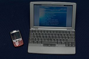
300px-Palm_FoleoMost people have no idea the Palm Foleo ever existed. Let’s rewind to May of 2007 when the Foleo was announced by Palm. You can read the initial information here. Remember, this device not only predates Chromebooks, it was what inspired the Netbook genre in the first place. It is really clear to me that this device was on target and it would have been wildly successful. All that can be easily tracked by looking at the sales numbers of Netbooks for the following few years. I am not going to add all the links here but I will provide a link to the search.
The device was killed by a lot of smart people who lacked vision. I would encourage you to read some of the articles. PC Magazine, Gartner, Tech blogs galore, all panned the device as a fool’s errand. Unfortunately for Palm, their leadership caved and abandoned the man who dreamed their company up in the first place. I bet they all regret that decision looking back, Palm is but a fading memory and with it many fortunes. This amazing device was instant-on, had long battery life, was inexpensive, synced docs and history with the cloud, had an app store, sound familiar?

The truth is that Jeff Hawkins is and was a genius. He gets it and understands how the human mind interfaces with the digital world in a way very few others have. The list of the device categories he has either invented or heavily driven are:

  • PDA’s
  • Smartphones
  • Tablets
  • Netbooks
  • Touch OS
  • App Stores
  • Probably a few others I am too slow to remember

The guy is possibly the single most influential thinker in mobile computing history. And he works in technology part-time to fund his real obsession, brain research! The shame is that he is rarely mentioned in the same breath as Gates, Jobs, Schmidt et al. He has innovated as much as anyone in the last 20 years.

The impact of Chromebooks on Windows RT

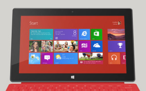
SurfaceRTI cannot imagine that the words “Chromebook” crossed anyones lips when Microsoft was discussing their target market. Bear with me as I make the connection. iPads and Android tablets are simply pdas/smartphones with really big screens. The devices and the OS they use spring from the “data bucket” concept. Their “orientation” is based on media consumption, not media production. Windows devices will always spring from a production mindset. Ingrained in the DNA of Microsoft is the utility of the computer. Creation of content has always been the focus of desktop and laptop computers running Windows, Linux, or OS X. Windows RT is a cloud focused, touch based representative of this ethos.
The Chromebook springs from the utility of the browser and web apps. Its premise is that all of life can exist in the cloud and production takes place in the browser. This is more akin to Windows RT than Android. I think I may have answered my own question I posed above. This may be why Chromebooks remain divergent from Android tablets. All the same I am irritated with Google for making my life complicated.

So with the connection made and the marketplace accepting the Chromebook, does that mean Windows RT has legs? I think it very well might but it remains to be seen whether Microsoft is really willing to bet its future on it. I believe if they do, they might have a chance to remain relevant. If they focus entirely on Windows 8 proper and its future brethren then I think they will devolve into obsolescence. Windows RT, in my estimation, is the only competitor that Chromebooks have. Only time will tell if Microsoft will place that bet.

Is the future of computing disposable and temporary devices?

Those of us that have been in the industry for a couple of decades understand the cyclical nature of technology. As I have written before, this is often in response to the same physical constraints being hit time after time. For the computer to be disposable, all data must reside in the cloud and they must be very inexpensive. Currently we are on swings for both of those things to be true. We have not hit the bottom of the barrel in cost of devices, because we have not yet approached the raw materials + production costs. We are also on a swing for all data to be stored in the cloud.

When you look back at the past you can see the progression. Computing started in the mainframe, moved to pc’s, swung back to client/server, moved to web devices, and now is moving to the cloud. The next step will be driven by yet unknown pressures solved by unknown technologies. For at least a time we will see the value of computing become more intrinsic to our lives but cost us less money, heartache and worry. A nice time to be using computers.

This article was written, researched and published on a Samsung Chromebook. I could have done this on a Surface RTjust as easily. This Chromebook is a great tool that I do not have to worry about compared to my top of the lineZenbook. For a day’s work it functions just as well. THAT is amazing.